
Understanding the Google User Experience Report
You’ve done your keyword research, your site architecture is clear and easy to navigate, and you’re giving users really obvious signals about how and why they should convert. But for some reason, conversion rates are the lowest they’ve ever been, and your rankings in Google are getting worse and worse.
You have two things in the back of your mind. First, recently a customer told your support team that the site was very slow to load. Second, Google has said that it is using site speed as part of how rankings are calculated.
It’s a common issue, and one of the biggest problems about site speed is it is so hard to prove it’s making the difference. We often have little-to-no power to impact site speed (apart from sacrificing those juicy tracking snippets and all that content we fought so hard to add in the first place). Even worse – some fundamental speed improvements can be a huge undertaking, regardless of the size of your dev team, so you need a really strong case to get changes made.
Sure, Google has the site speed impact calculator which gives an estimate of how much revenue you could be losing for loading more slowly, and if that gives you enough to make your case – great! Crack on. Chances are, though, that isn’t enough. A person could raise all kinds of objections, for instance;
- That’s not real-world data
- That tool is trying to access the site from one place in the world, our users live elsewhere so it will load faster for them
- We have no idea how the tool is trying to load our site, our users are using browsers to access our content, they will see different behaviour
- That tool doesn’t know our industry
- The site seems pretty fast to me
- The ranking/conversion/money problems started over the last few months – there’s no evidence that site speed got worse over that time.

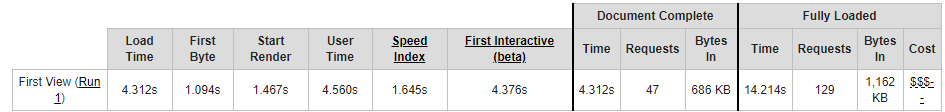
Pretty much any site speed checker will run into some combination of the above objections. Say we use webpagetest.org (which wouldn’t be a bad choice), when we give it a url, an automated system accesses our site tests how long it takes to load, and reports to us on that. As I say, not a bad choice but it’s very hard to to test accessing our site from everywhere our users are, using the browsers they are using, getting historic data that was recording even when everything was hunky-dory and site speed was far from our minds, and getting comparable data for our competitors.
Or is it?
Enter the Chrome User Experience (CRUX) report
In October 2017 Google released the Chrome User Experience report. The clue is in the name – this is anonymised domain-by-domain, country-by-country site speed data they have been recording through real-life Google Chrome users since October 2017. The data only includes records from Chrome users which have opted into syncing browser history, and have usage statistic reporting enabled, however many will have this on by default (see Google post). So this resource offers you real-world data on how fast your site is.
That brings us to the first thing you should know about the CRUX report.
1. What site speed data does the Chrome User Experience report contain?
In the simplest terms, the CRUX report gives recordings of how long it took your webpages to load. But loading isn’t on-off, even if you’re not familiar with web development, you will have noticed that when you ask for a web page, it thinks a bit, some of the content appears, maybe the page shuffles around a bit and eventually everything falls into place.

There are loads of reasons that different parts of that process could be slower, which means that getting recordings for different page load milestones can help us work out what needs work.
Google’s Chrome User Experience report gives readings for a few important stages of webpage load. They have given definitions here but I’ve also written some out below;
- First Input Delay
- This is more experimental, it’s the length of time between a user clicking a button and the site registering the click
- If this is slow the user might think the screen is frozen
- First Paint
- The first time anything is loaded on the page, if this is slow the user will be left looking at a black screen
- First Contentful Paint
- Similar to first paint, this is the first time any user-visible content is loaded onto the screen (i.e. text or images).
- As with First Paint, if this is slow the user will be waiting, looking at a blank screen
- DOM Content Loaded
- This is when all the html has been loaded. According to Google, it doesn’t include CSS and all images but by-and-large once you reach this point, the page should be usable, it’s quite an important milestone.
- If this is slow the user will probably be waiting for content to appear on the page, piece by piece.
- Onload
- This is the last milestone and potentially a bit misleading. A page hits Onload when all the initial content has finished loading, which could lead you to believe users will be waiting for Onload. However, many web pages can be quite operational, as the Emperor would say, before Onload. Users might not even notice that the page hasn’t reached Onload.
- To what extent Onload is a factor in Google ranking calculations is another question but in terms of User Experience I would prioritise the milestones before this.

All of that data is broken down by;
- Domain (called ‘origin’)
- Country
- Device – desktop, tablet, mobile (called ‘client’)
- Connection speed
So for example, you could see data for just visitors to your site, from Korea, on desktop, with a slow connection speed.
2. How can I access the Chrome User Experience report?
There are two main ways you can access Google’s Chrome user site speed data. The way I strongly recommend is getting it out using BigQuery, either by yourself or with the help of a responsible adult.
DO USE BIGQUERY
If you don’t know what BigQuery is, it’s a way of storing and accessing huge sets of data. You will need to use SQL to get the data out but that doesn’t mean you need to be able to write SQL. This tutorial from Paul Calvano is phenomenal and comes with a bunch of copy-paste code you can use to get some results. When you’re using BigQuery, you’ll ask for certain data, for instance, “give me how fast my domain and these two competitors reach First Contentful Paint”. Then you should be able to save that straight to Google Sheets or a csv file to play around with (also well demonstrated by Paul).
DO NOT USE THE PREBUILT DATA STUDIO DASHBOARD
The other, easier option, which I actually recommend against is the CRUX Data Studio dashboard. On the surface, this is a fantastic way to get site speed data over time. Unfortunately, there are a couple key gotchas for this dashboard which we need to watch out for. As you can see in the screenshot below, the dashboard will give you a readout of how often your site was Fast, Average, or Slow to reach each loading point. That is actually a pretty effective way to display the data over time for a quick benchmark of performance. One thing to watch out for with Fast, Average, and Slow is that the description of the thresholds for each isn’t quite right.
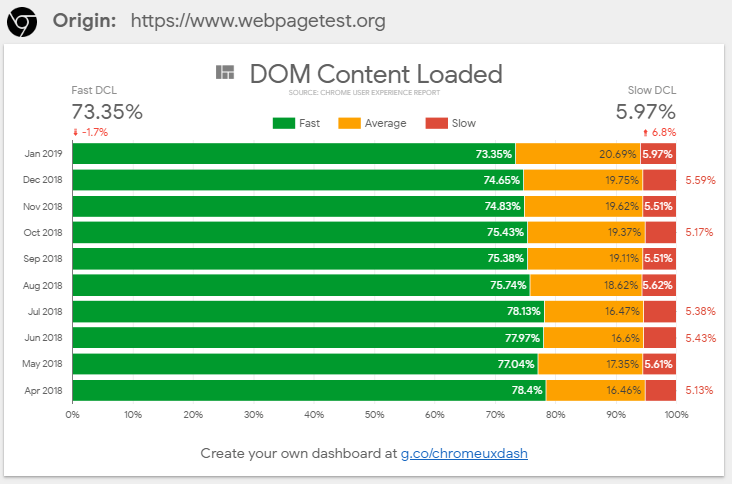
If you compare the percentages of Fast, Average, and Slow in that report with the data direct from BigQuery they don’t line up. It’s an understandable documentation slip but please don’t use those numbers without checking them. I’ve chatted with the team and submitted a bug report on the Github for this tool. I’ve also listed the true definitions below, in case you want to use Google’s report despite the compromises, or use the Fast, Average, Slow categorisations in the reports you create (as I say, it’s a good way to present the data). The link to generate one of these reports is g.co/chromeuxdash.
Another issue is that it uses the “all” dataset – meaning data from every country in the world. That means data from US users is going to be influenced by data from Australian users. It’s an understandable choice given the fact that this report is free, easily generated, and probably took a bunch of time to put together, but it’s taking us further away from that real-world data we were looking for. We can be certain that internet speeds in different countries will vary quite a lot (for instance South Korea is well known for having very fast internet speeds) but also that expectations of performance could vary by country as well. You don’t care if your site speed looks better than your competitor because you’re combining countries in a convenient way, you care if your site is fast enough to make you money. By accessing the report through BigQuery we can select data from just the country we’re interested in and get a more accurate view.
The final big problem with the Data Studio dashboard is it lumps desktop results in with mobile and tablet. That means that even looking at one site over time, it could look like your site speed has taken a major hit one month just because you happened to have more users on a slower connection that month. It doesn’t matter whether desktop users tend to load your pages faster than mobile, or vice versa – if your site speed dashboard can make it look like your site speed is drastically better or worse because you’ve started a facebook advertising campaign that’s not a useful dashboard.
The problems get even worse if you’re trying to compare two domains using this dashboard – one might naturally have more mobile traffic than the other, for example. It’s not a direct comparison and could actually be quite misleading. I’ve included a solution to this in the section below, but it will only work if you’re accessing the data with BigQuery.
Wondering why the Data Studio dashboard reports % of Fast, Average, and Slow, rather than just how long it takes your site to reach a certain load point? Read the next section!
3. Why doesn’t the CRUX report give me one number for load times?
This is important – your website does not have one amount of time that it takes to load a page. I’m not talking about the difference between First Paint or Dom Content Loaded, those numbers will of course be different. I’m talking about the differences within each metric every single time someone accesses a page.
It could take 3 seconds for someone in Tallahassee to reach Dom Content Loaded, 2 seconds for someone in London. Then another person in London loads the page on a different connection type, Dom Content Loaded could take 1.5 seconds. Then another person in London loads the page when the server is under more stress, it takes 4 seconds. The amount of time it takes to load a page looks less like this;
And more like this;
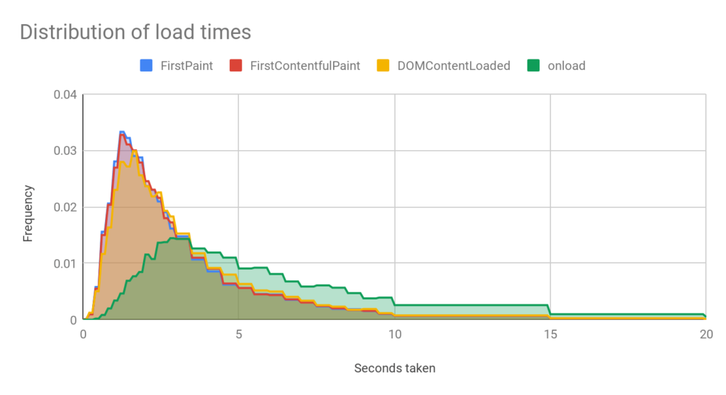
That chart is showing a distribution of load times. Looking at that graph, you could think 95% of the time, the site is reaching DOM Content Loaded in under 8 seconds. On the other hand you could look at the peak and say it most commonly loads in around 1.7 seconds, but you could, for example see a strange peak at around 5 seconds and realise – something is intermittently going wrong that means sometimes the site takes much longer to load.
So you see saying “our site loads in X seconds, it used to load in Y seconds” could be useful when you’re trying to deliver a clear number to someone who doesn’t have time to understand the finer points, but it’s important for you to understand that performance isn’t constant and your site is being judged by what it tends to do, not what it does under sterile testing conditions.
4. What limitations are there in the Chrome User Experience report?
This data is fantastic (in case you hadn’t picked up before, I’m all for it) but there are certain limitations you need to bear in mind.
No raw numbers
The Chrome User Experience report will give us data on any domain contained in the data set. You don’t have to prove you own the site to look it up. That is fantastic data, but it’s also quite understandable that they can’t get away with giving actual numbers. If they did, it would take approximately 2 seconds for an SEO to sum all the numbers together and start getting monthly traffic estimates for all of their competitors.
As a result, all of the data comes as a percentage of total throughout the month, expressed in decimals. A good sense check when you’re working with this data is that all of your categories should add up to 1 (or 100%) unless you’re deliberately ignoring some of the data and know the caveats.
Domain-level data only
The data available from BigQuery is domain-level only, we can’t break it down page-by-page which does mean we can’t find the individual pages which load particularly slowly. Once you have confirmed you might have a problem, you could use a tool like Sitebulb to test page load times en-masse to get an idea of which pages on your site are the worst culprits.
No data at all when there isn’t much data
There will be some sites which don’t appear in some of the territory data sets, or at all. That’s because Google hasn’t added their data to the dataset, potentially because they don’t get enough traffic.
Losing data for the worst load times
This data set is unlikely to be effective at telling you about very very long load times. If you send a tool like webpagetest.org to a page on your site, it’ll sit and wait until that page has totally finished loading, then it’ll tell you what happened.
When a user accesses a page on your site there are all kinds of reasons they might not let it load fully. They might see the button they want to click early on and click on it before too much happened, if it’s taking a very long time they might give up altogether.
This means that the CRUX data is a bit unbalanced – the further we look along the “load time” axis, the less likely it is it’ll include representative data. Fortunately, it’s quite unlikely your site will be returning mostly fast load times and then a bunch of very slow load times. If performance is bad the whole distribution will likely shift towards the bad end of the scale.
The team at Google have confirmed that if a user doesn’t meet a milestone at all (for instance Onload) the recording for that milestone will be thrown out but they won’t throw out the readings for every milestone in that load. So, for example, if the user clicks away before Onload, Onload won’t be recorded at all, but if they have reached Dom Content Loaded, that will be recorded.
Combining stats for different devices
As I mentioned above – one problem with the CRUX report is all of the reported data is as a percentage of all requests.
So for instance, it might report that 10% of requests reached First Paint in 0.1 seconds. The problem with that is that response times are likely different for desktop and mobile – different connection speeds, processor power, probably even different content on the page. But desktop and mobile are lumped together for each domain and in each month, which means that a difference in the proportion of mobile users between domains or between months can mean that site speed could even look better, when it’s actually worse, or vice versa.
This is a problem when we’re accessing the data through BigQuery, as much as it is if we use the auto-generated Data Studio report, but there’s a solution if we’re working with the BigQuery data. This can be a bit of a noodle-boiler so let’s look at a table.
| Device | Response time (seconds) | % of total |
| Phone | 0.1 | 10 |
| Desktop | 0.1 | 20 |
| Phone | 0.2 | 50 |
| Desktop | 0.2 | 20 |
In the data above, 10% of total responses were for mobile, and returned a response in 0.1 seconds. 20% of responses were on desktop and returned a response in 0.1 seconds.
If we summed that all together, we would say 30% of the time, our site gave a response in 0.1 seconds. But that’s thrown off by the fact that we’re combining desktop and mobile which will perform differently. Say we decide we are only going to look at desktop responses. If we just remove the mobile data (below), we see that, on desktop, we’re equally likely to give a response at 0.1 and at 0.2 seconds. So actually, for desktop users we have a 50/50 chance. Quite different to the 30% we got when combining the two.
| Device | Response time (seconds) | % of total |
| Desktop | 0.1 | 20 |
| Desktop | 0.2 | 20 |
Fortunately, this sense-check also provides our solution, we need to calculate each of these percentages, as a proportion of the overall volume for that device. While it’s fiddly and a bit mind-bending, it’s quite achievable. Here are the steps;
- Get all the data for the domain, for the month, including all devices.
- Sum together the total % of responses for each device, if doing this in Excel or Google Sheets, a pivot table will do this for you just fine.
- For each row of your original data, divide the % of total, by the total amount for that device, e.g. below
Percent by device
| Device | % of total |
| Desktop | 40 |
| Phone | 60 |
Original data with adjusted volume
| Device | Response time (seconds) | % of total | Device % (from table above) | Adjusted % of total |
| Phone | 0.1 | 10 | 60 | 10% / 60% = 16.7% |
| Desktop | 0.1 | 20 | 40 | 20% / 40% = 50% |
| Phone | 0.2 | 50 | 60 | 50% / 60% = 83.3% |
| Desktop | 0.2 | 20 | 40 | 20% / 40% = 50% |
5. How should I present Chrome User Experience site speed data?
Because none of the milestones in the Chrome User Experience report have one number as an answer, it can be a challenge to visualise more than a small cross section of the data. Here are some visualisation types that I’ve found useful.
% of responses within “Fast”, “Average”, and “Slow” thresholds
As I mention above, the CRUX team have hit on a good way of displaying performance for these milestones over time. The automatic Data Studio dashboard shows the proportion of each metric over time, that gives you a way to see if a slowdown is a result of being Average or Slow more often, for example. Trying to visualise more than one of the milestones on one graph becomes a bit messy so I’ve found myself splitting out Fast, and Average so I can chart multiple milestones on one graph.
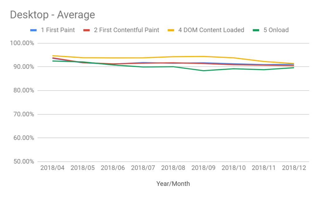
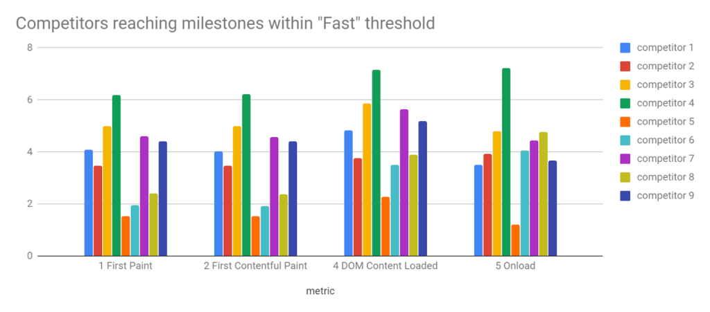
I’ve also used the Fast, Average, and Slow buckets to compare a few different sites during the same time period, to get a competitive overview.
An alternative which Paul Calvano demonstrates so well is histograms. This helps you see how distributions break down. The Fast, Average, and Slow bandings can hide some sins in that movement within those bands will still impact user experience. Histograms can also give you an idea of where you might be falling down in comparison to others, or your past performance and could help you identify things like inconsistent site performance. It can be difficult to understand a graph with more than a couple time periods or domains on it at the same time, though.

I’m sure there are many other (perhaps better) ways to display this data so feel free to have a play around. The main thing to bear in mind is that there are so many facets to this data it’s necessary to simplify it in some way, otherwise we just won’t be able to make sense of it on a graph.
What do you think?
Hopefully, this post gives you some ideas about how you could use the Chrome User Experience report to identify whether you should improve your site speed.
Bonus – what are the actual thresholds in the CRUX Data Studio report?
As mentioned above, the thresholds in the CRUX Data Studio report aren’t 100% correct, I have submitted a GitHub issue but here are the updated thresholds.
| Listed definition | Actual time | |
| FCP Fast | X <1 second | X < 1 second |
| FCP Average | 1 < x < 3 | 1 < X< 2.5 |
| FCP Slow | X >= 3 seconds | X >= 2.5 seconds |
| FIrst Paint Fast | X <1 second | X < 1 second |
| First Paint Average | 1 < x < 3 | 1 < x < 2.5 |
| First Paint Slow | X >= 3 seconds | X >= 2.5 |
| First Input Delay Fast | X < 100 mil | X< 50 mil |
| First Input Delay Average | 100 mil < x < 1 | 50 mil < x < 250 mil |
| First Input Delay Slow | X > 1 | X > 250 mil |
| DOM Content Load Fast | X < 1 | X < 1.5 |
| DOM Content Load Average | 1 < x < 3 | 1.5 < x < 3.5 |
| DOM Content Load Slow | X > 3 | X > 3.5 |
| Onload Fast | X < 1 | X < 2.5 |
| Onload Average | 1 < x < 3 | 2.5 < x < 6.5 |
| Onload Slow | x >3 | X > 6.5 |