What makes a good landing page in 2020?
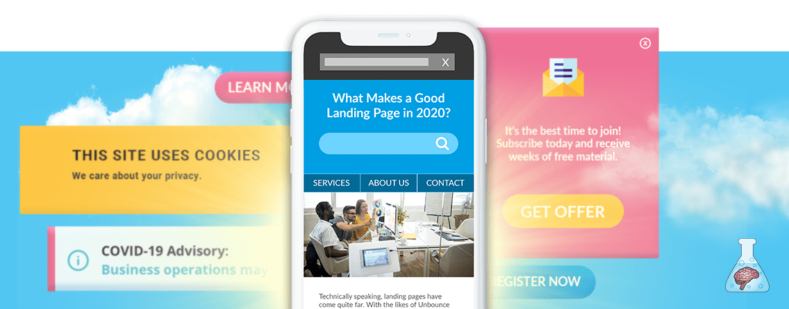
Beyond the COVID banner, past the pop-up discount offer, through the multiple CTA buttons, links and beneath the GDPR statement. There lies a landing page.
Sound like a recent browsing experience?
With all that clutter, it’s no wonder more than 55% of site visitors spend less than 15 seconds on a site. Your ideal product/service/message to your ideal potential customer, lost behind a sea of noise. Valuable content that your team has crafted, hidden in plain sight or worse still, it’s an effort to find it.
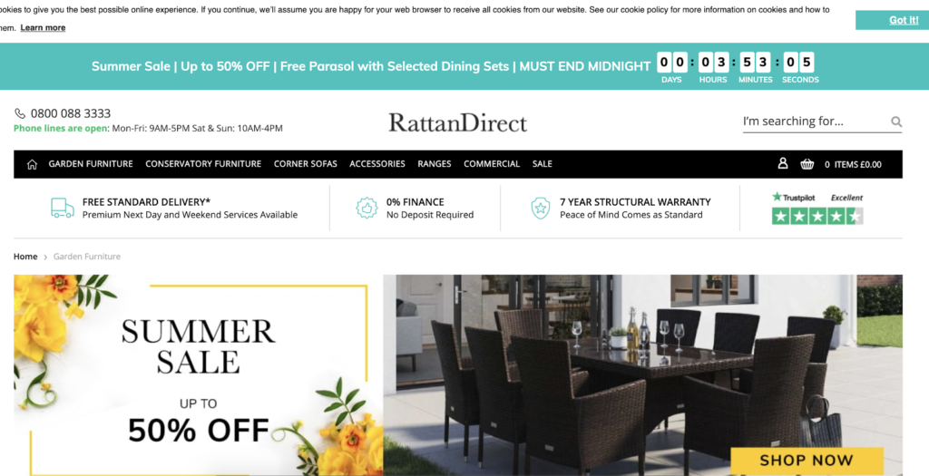
Example: After a search for Garden furniture, it’s hard to find on RattanDirect’s landing page:

Technically speaking, landing pages have come quite far. With the likes of Unbounce and Instapage, allowing you to knock up a page in minutes, no-coding experience needed. It still makes me a little glum to see the basic principles being missed in 2020 (the least of this year’s concerns but that’s a whole ‘nother article!).
By nature, landing pages are created for specific marketing or advertising campaigns. Done well, they’re an incredibly effective tool. Showcasing your offering at the right time for your target audience is conversion gold. So well that on average, dedicated landing pages convert 65% higher than a standard page on your website. Why are they still seen as merely a bolt on to ads then? Money wasted. Ideal potential customers turned away, never to return. All because of neglecting that first hurdle. The good news (finally, you say) is that we know how to overcome this. And no, it isn’t through increasing ad spend. You wouldn’t pile more money into the garden when the house is falling over!
Landing pages in 2020
After spending the last 5 years auditing hundreds of landing pages, I’m going to tell you what good looks like for the 2020 browser. There isn’t a perfect landing page, or a one size fits all template, but shared components that lead to a happy customer and ultimately results.
The basics are well trodden here. We even have our own nifty SMART methodology for you to benchmark yourself against:
- Speed – how fast do your pages load? Are users leaving before the content loads?
- Mobile – have you designed your pages to be mobile-first or squashed ALL the desktop information down onto a teeny tiny screen?
- Alignment – does the content match the campaign users arrived from?
- Riveting – are you showcasing your product in a valuable way? Does it entice a user to engage and continue closer to that sale?
- Transparency & trust – why would someone choose you? Do you have any proof of your capabilities? Are you clear in your offering?
Get in touch to see how your landing pages stack up. In the meantime, I’m going to navigate you through the top ways to declutter the noise and level up those pages ahead of the competition.
Meet users in the moment
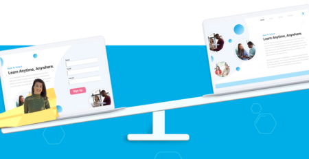
Consider the various ways in which you digitally consume – from idle scrolling on a lunch break to multi-tab laptop research. The openness to be “sold to” greatly differs by context. Pushing a Buy Now, time-sensitive offer to a new visitor that just discovered you through a witty Instagram post is not likely to land as well as a hungry return visitor that came back to you via a Search Ad. Understanding these micro-moments (as Google dubbed them) and satisfying these different intents through tailored landing pages will set you up for success.
With more advanced audience data than ever before, mapping each consideration stage to the most impactful messaging needs at that time is more likely to hit the spot than a one-size-fits-all landing page. Depending on your ad strategy, this could be grouped by channel or even keywords. The clearer you get on who your product or service is for, the easier it is to answer their pain points with your solution.
How to access these insights:
- Search query report in Google Ads – looking at which search queries drove most of the conversions is a sure-fire way to know which direction to take your landing pages. Where are users at? Are they searching for more information or ready to pull the trigger?
- Time of day combined with device reports in GA – right now, this could be a whole different picture with people stuck to their computers. Building up a picture of when and how visitors hit your landing page will give you an indication of whether they are more lunchtime researchers or evening spenders.

First Impressions Count
We’ve gone from big mobile screens, small screens and full-circle again – with the rate at which devices are being released, designing a responsive mobile-first landing page is more crucial than ever. You wouldn’t be wrong in thinking that a viewport is something only a spacecraft should concern itself with. But in the world of mobile landing pages, the viewport is the visual area of your page as soon as you land. Ensuring the layout is fluid will show off your stellar value proposition.
By this I mean, the enticing messaging and imagery you’re using to engage and compel users into some form of action. If the layout is fixed, the headline could spill over past the screen and the image could be chopped in a compromising way. There goes an increase in bounce rate and your copywriter’s frustration levels.
As well as making sure your content sizes up, consider the speed at which the page loads. Not only has page speed been a direct SEO ranking factor since 2018, but it is now also part of a series of signals that constitute what Google calls “page experience”. Although this has been rumoured for a while, the confirmation compounds the importance of optimizing towards speed metrics. The faster the content loads, the less likely users are to leave. Not only providing users with a positive experience but increasing the likelihood of converting.
Alongside ensuring your landing page actually functions well across devices, getting to the crux of your offer will not only reassure visitors that they’re in the right place but encourage them to browse further.
Four key questions users want answered within seconds are:
- Who is this product/service for?
- Does it address their current pain point?
- Why should they choose us over a competitor?
- What should they do next (hopefully with a twinkling CTA)?

Solve actual pain points to move you closer to personalisation
In the hype of personalisation being overly used as a far-reaching strategy, saved only for the likes of Amazon. Marketers dismiss that for the most part, users actually want to be provided with tailored information.
Rather than rely on the rich data sets required for 1:1 personalisation, you can provide valuable content to your users if you know who they are. Segmentation helps you understand the motivations and cluster of those that drive revenue. Through building up multi-faceted data points about this group, you can then serve them in a meaningful way.
How so?
Dynamic headlines – start small. Follow the ad keyword through to the landing page headline to increase consistency and ease cognitive dissonance for a user. This message mis-match is one the biggest opportunity areas we see on landing pages. Users should be certain they’re in the right place based on the ad they’ve just clicked on. Depending on your tech stack this can be done simply through the likes of Unbounce or with the wonderfully integrated query parameter targeting through Google Optimize.
Previous onsite behaviour – if users leave before completing a purchase, it could be indication of the research phase rather than not wanting your product. Create an audience to retarget to. If they return to the site, get that product in front of them again with a dedicated landing page. Why not throw in an enticing offer like free delivery to help them complete the purchase?
Localised social proof – a tried-and-tested component of any site, social proof has made many a headline over the years for its powers of persuasion. We put our trust (and our money) in wholeheartedly if someone has trodden the path ahead of us. Our desire to conform and mimic those we find aspirational becomes even easier to encourage if we can see ourselves in the content. This trust can be built through product reviews of answers to potential objections. Take it a step further and include testimonials based on visitors in the same local area which instinctively feels more relatable.

Mimic the ease of Lead Form Extensions
At the end of last year, Google announced their solution to form friction on mobile in the manner of Lead Form Extensions. Catering to time-sensitive mobile users who want to get in touch without the fuss of multiple fields. Lead Form Extensions appears as part of the search results and can be fired off in one click. What can we learn from this signal to apply to lead-gen landing pages?
- Keep form fields to a minimum. In this privacy sensitive era, only asking for essential information and providing a reason why you need it will be the difference between someone choosing you over a competitor
- Allow fields to auto-complete. With the number of APIs available for addresses and payment options, make it as quick and efficient as possible for users to provide you with their details.

TL:DR Summary
With research showing that businesses with +31 landing pages generated 7 times more leads than those with less than 5 landing pages, the case is not whether to adopt them in your marketing strategy but how. Cover the basics and move onto a more advanced approach through ongoing testing and learning. Those that ignore the opportunity to meet users where they are will fall behind. The landing page is still alive and kicking in 2020. Are yours fit for purpose?