
Improving UX through Analytics
User experience is important – little hitches in your site’s user experience could cost you conversions and repeat visitors, big ones could have your customers leaving to competitors in their droves. At the same time, finding problems and identifying opportunities can be hard and expensive, requiring extensive user testing and time-consuming A/B tests. However, that doesn’t mean there isn’t any low-hanging fruit in the data you already have. Read on for easy fixes to improve your site.
1 – 404 Errors
You can easily check for internally linked 404 pages with a crawling tool like Screaming Frog, but this might not give you the full picture – visitors could be landing on 404 pages from external links, or there may be intermittent issues missed by your one-off crawl.
To see all of your visited 404 URLs, search for your 404 page’s Page Title:
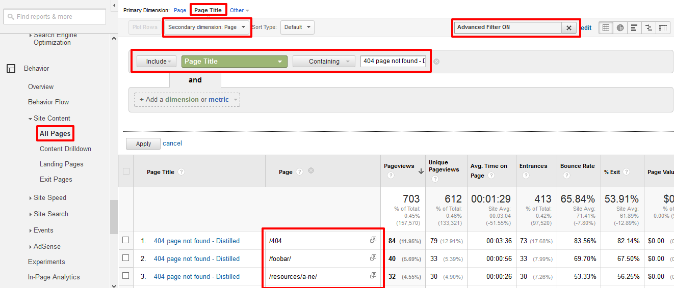
The above example shows the All Pages report in Google Analytics, with Page Title as the primary dimension, and an advanced filter for our 404 page’s <title> text. In the second column I have the secondary dimension Page, which gives me the path of all the URLs that have been returning 404s. If I’m not familiar with any of them or don’t understand why they’re receiving traffic, I can dig in further using the User Flow report:
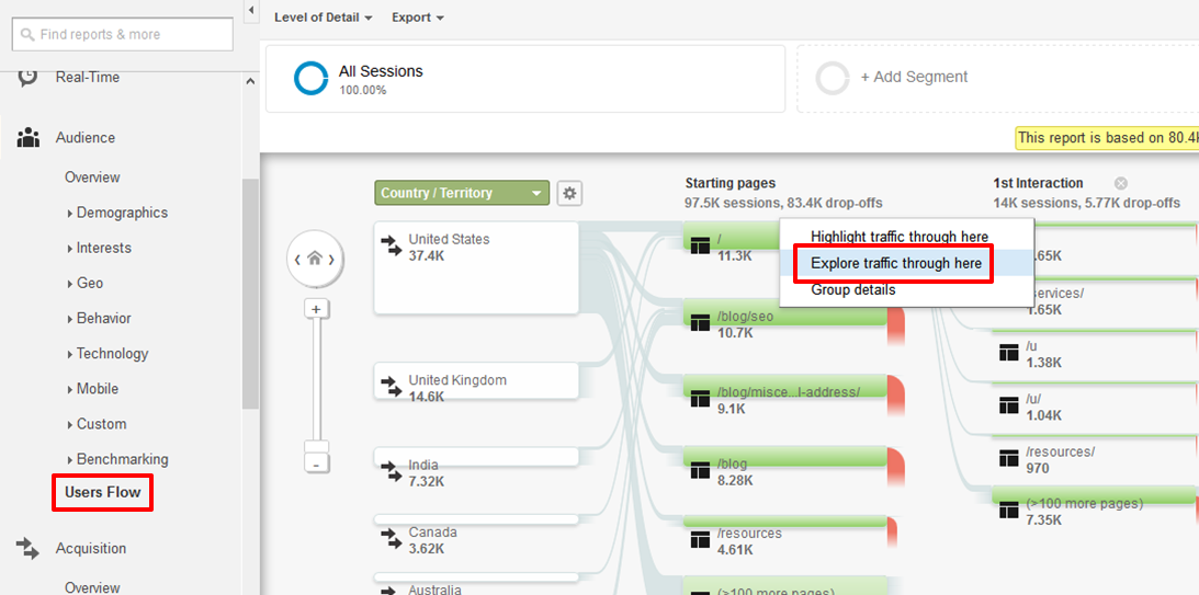
The /404 URL isn’t receiving enough traffic to be shown in the initial User Flow report, but there is an easy way to get to it quickly. Firstly, explore traffic through any URL (in the case pictured, this is the homepage).
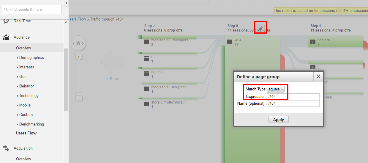
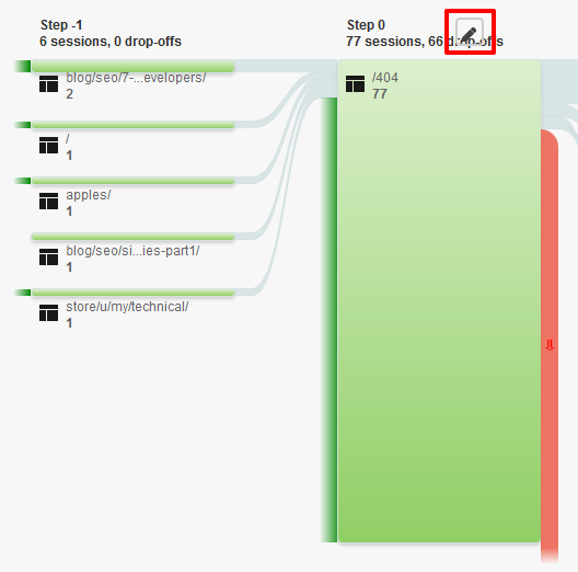
The pen symbol above the visualisation can then be used to set any URL (or group of URLs) that I want to dig into.
In this example, /404 is receiving most of its traffic as a landing page, so the final step is to check out where that traffic is coming from:
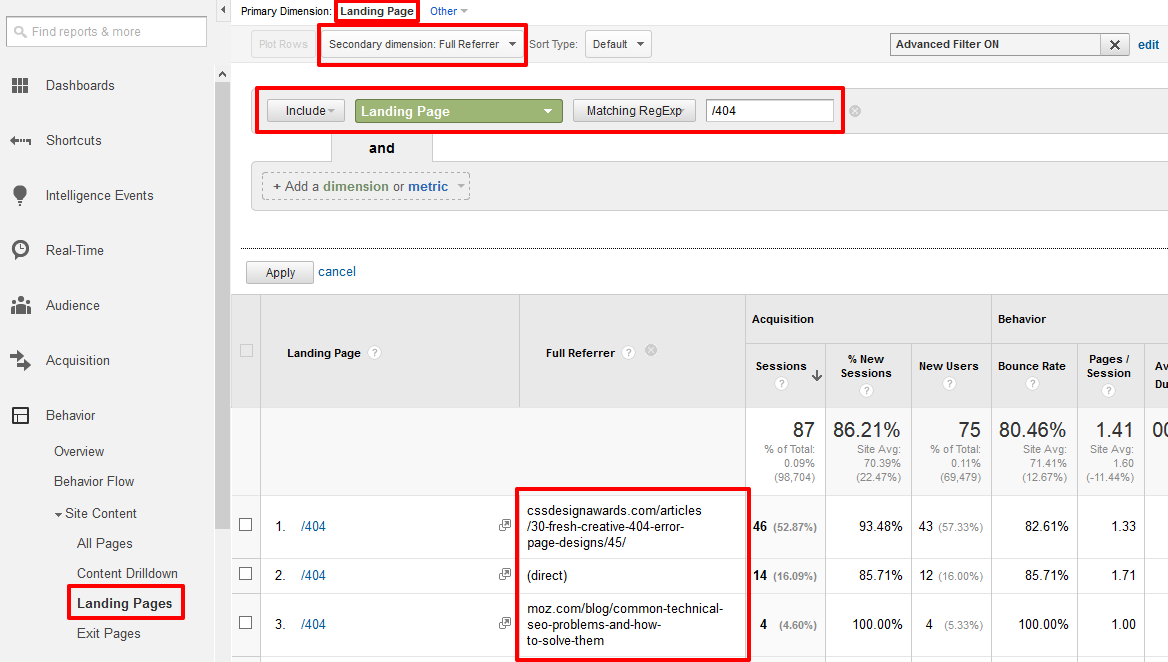
It turns out that both referrers are intentionally referencing Distilled’s creative 404 page design – so nothing to worry about there. If, however, it was coming from a link on Moz with the anchor text “Distilled”, it’d be a major user experience glitch, and we might want to contact them and get that fixed. Similarly, if the User Flow report had revealed that most of this page’s traffic was coming from other pages on Distilled.net, we’d want to investigate the links on those pages.
2 – Site Search
Users will often use a site’s search functionality to look for things they’ve been unable to find in the main navigation, and this makes it a goldmine for User Experience tips.
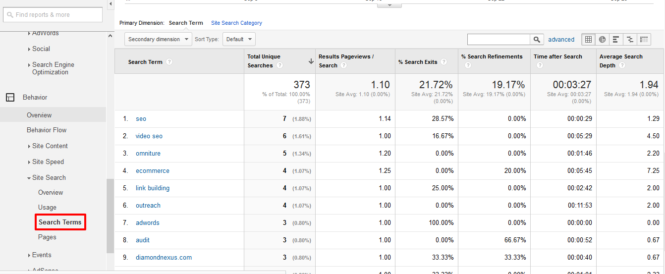
In the above example – taken from Distilled’s Search Terms report for September – there are no overwhelming favourite search terms. In fact, relatively few visits include searches at all. On e-commerce sites, however, it’s common to see something that’s missing from their category menus dominating the search terms report – for example, on a widgets site with categories for red, blue and green widgets, you might see a large number of searches for yellow widgets. In this case, you could consider making an additional category, or replacing an existing low-traffic category page.
We can gain further insight into how people are using site search by setting “start page” as a secondary dimension:
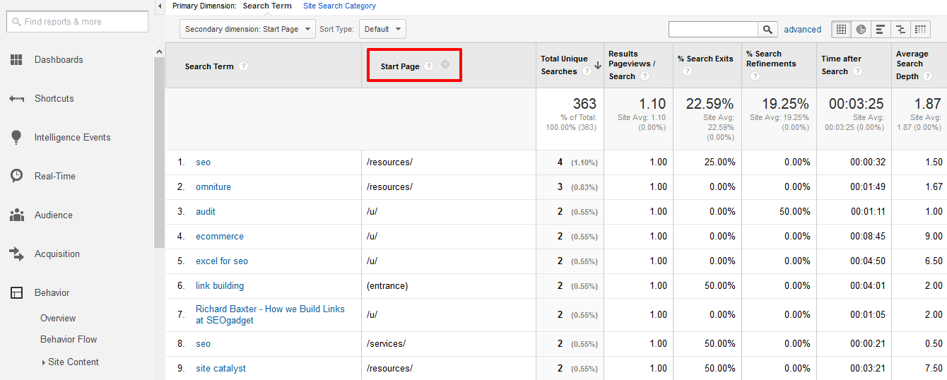
The fact that people are searching for “seo” from our resources page suggests that this page would perhaps benefit from a post category navigation. That said, it’s worth keeping some perspective – this is only 4 searches in nearly 4000 visits to the resources page.
3 – External Links
404s aren’t the only type of unsatisfactory landing page – CPC, referral and social can commonly direct people to the wrong page as a result of simple human error. The below report uses the built in “Referral Traffic” segment, and then filters by bounce rate. Looking at only high-bounce rate examples can help to spot the worst offenders, but if you have any very high volume sources, it might be worth checking these also – even if the bounce rate seems okay.
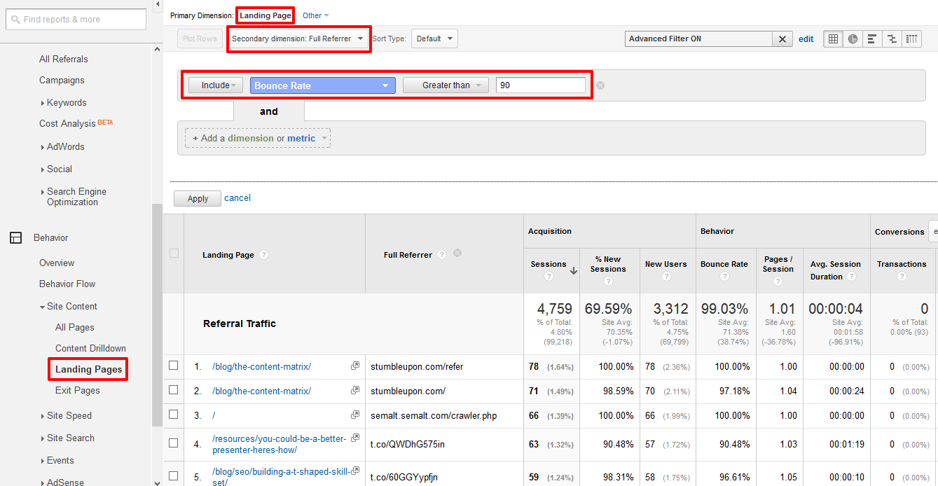
There are no causes for alarm in the above example, but it’s not unusual to see blog posts or “useful external resources” pages appear here, and often it’s because they link to the wrong page – for example, a link to “Recommended PPC Agencies” that targeted an Organic Search services page would be likely to have a high bounce rate, and would represent a potential loss of business. In such a case, you could contact the site owner to thank them for the recommendation, and request that the link be updated for the benefit of their users.
4 – International Targeting
If your site has language or localisation targeted pages, it’s useful to check them against the countries that they’re supposed to be receiving traffic from.
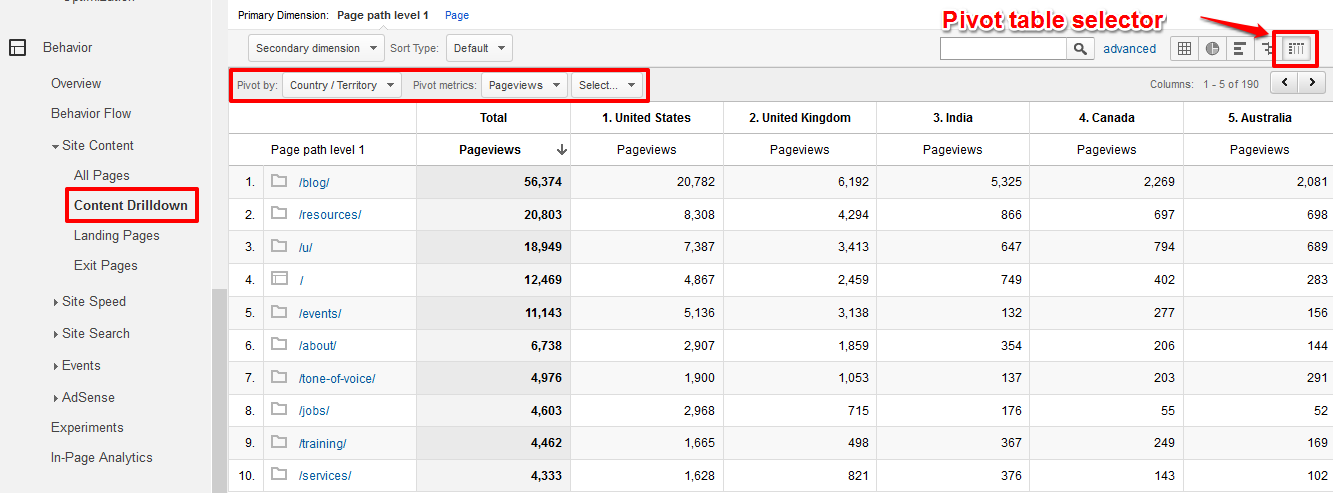
The best way to monitor this varies according to the targeting solution. One common solution is subfolders: /en/, /fr/, etc. Although Distilled doesn’t use this approach, the below report – Content Drilldown pivoted by country – works well for this type of international targeting checkup:
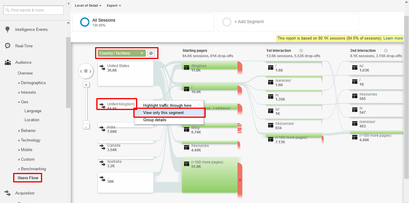
If you’re using separate views for each targeted version, it can be helpful to use User Flow reports. For example, in the view for the United States domain, I might want to dig into UK traffic:
5 – Browsers and Screens
There’s always some combination of screen configuration that will escape your user testing. These can be difficult to track down at the best of times, but there are a couple of handy reports for spotting any larger issues. The first of these is the exit page report, pivoted by browser or screen resolution:
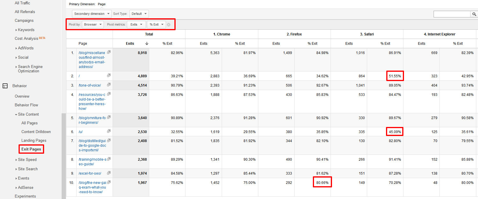
What we’re looking for here is pages with abnormally high exit rates on certain browsers. Based on the example above, there are a couple of pages I might want to check out on Safari, and one underperforming on Firefox. If there are no immediate issues, it might be worth digging further into the analytics data – particularly if the browser in question is correlated with lower screen resolutions or older devices.
However, exit rates don’t always tell the whole story, as users may look for an alternative route rather than leaving the site entirely. Using pageviews as a metric, we can look to identify pages that users are struggling to reach:
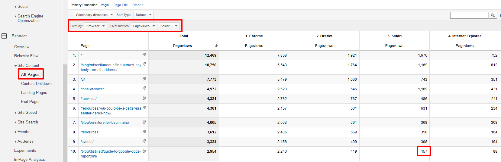
In the above example, we can see that Safari users are far less likely to reach a certain page than users of other browsers – for most pages Safari’s traffic is around 10% of the site’s total, whereas for this page it’s around 5%. Of course, there could be reasons for this besides a browser-specific issue – Safari users might be disproportionately interested in certain areas of the site, for example.
6 – Site Speed
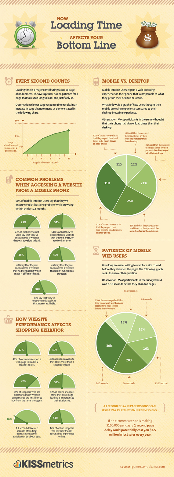
Site speed is a massive issue for user experience, even more so than we realise – as numerous studies have shown:
-
Slowing down the Google search results page by 100 to 400 milliseconds has a measurable impact on the number of searches per user of -0.2% to -0.6%, Google.
-
Page abandonment doubles with an increase in page load time from 2 to 4 seconds, Kissmetrics.
-
‘Just One Second Delay In Page-Load Can Cause 7% Loss In Customer Conversions’, TagMan.
-
A page that took 6 seconds to load in 2010 suffered a -40% conversion hit. Today, a 6-second page takes a -50% hit, Tammy Everts.
Perhaps the two best site speed metrics in Google Analytics are available in the little-known DOM Timings report:
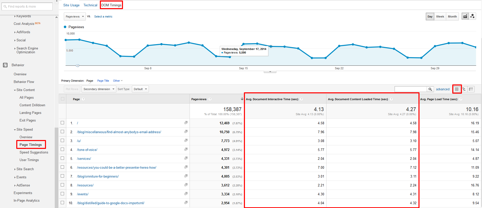
Note that by default this report is a “Comparison” report, and has to be set as a “Data” report using the button to the right of the filter box.
Many of Distilled’s pages are long, and designed to be scrolled down by a user, and as such, have fairly long page load times. However, users can interact with the page long before the content right at the bottom is loaded, and the metrics shown in this report help to understand that relationship.
In the above example, it’s noticeable that some longer blog posts have very high Document Interactive Times, making them prime targets for further investigation. In many cases the high average will be the result of a particularly slow segment which can be traced back to a browser bug (which you can fix) or disproportionate number of users from developing nations (which you shouldn’t fix, but might want to keep in mind).
More on User Experience
No site is perfect, but the six areas of this post should offer a place to start improving any online user experience. If you want to go further, you could check out these posts by Distillers on the Moz Blog:
-
Tim Allen talks about optimising for your users’ screen sizes
-
Kristina Kledzik talks about User Experience methodology
-
Paddy Moogan offers a framework to get you started with Conversion Rate Optimisation

