
Google Data Studio: using Google Sheets as a data source
Data Studio lets us visualize data from many sources. At Distilled, we’ve been using Google Sheets to do most of our reporting for years. It works well—but transitioning to Data Studio is so satisfying. It’s easier to manage permissions. And it’s also easier to get Google Analytics data into Data Studio than Sheets.
Here’s the thing: it’s still downright fun to use Sheets as a data source in Data Studio. You can see your data, interact with it, and then chart it. Sheets gives you the power of Data Studio without the bother of managing databases. Anyone can do it.
This post explains how to use Google Sheets as a data source in Data Studio. I recommend opening these documents as you follow along:
This post uses public datasets on the gender wage gap in the US. The Economic Policy Institute provides these datasets. Their analysis of the wage gap is thorough and insightful—worth queueing up!
Organize the Google Sheet
The key to using Google Sheets with Data Studio is formatting. A Sheet is worth a thousand words—the example Sheet will show you what we want:
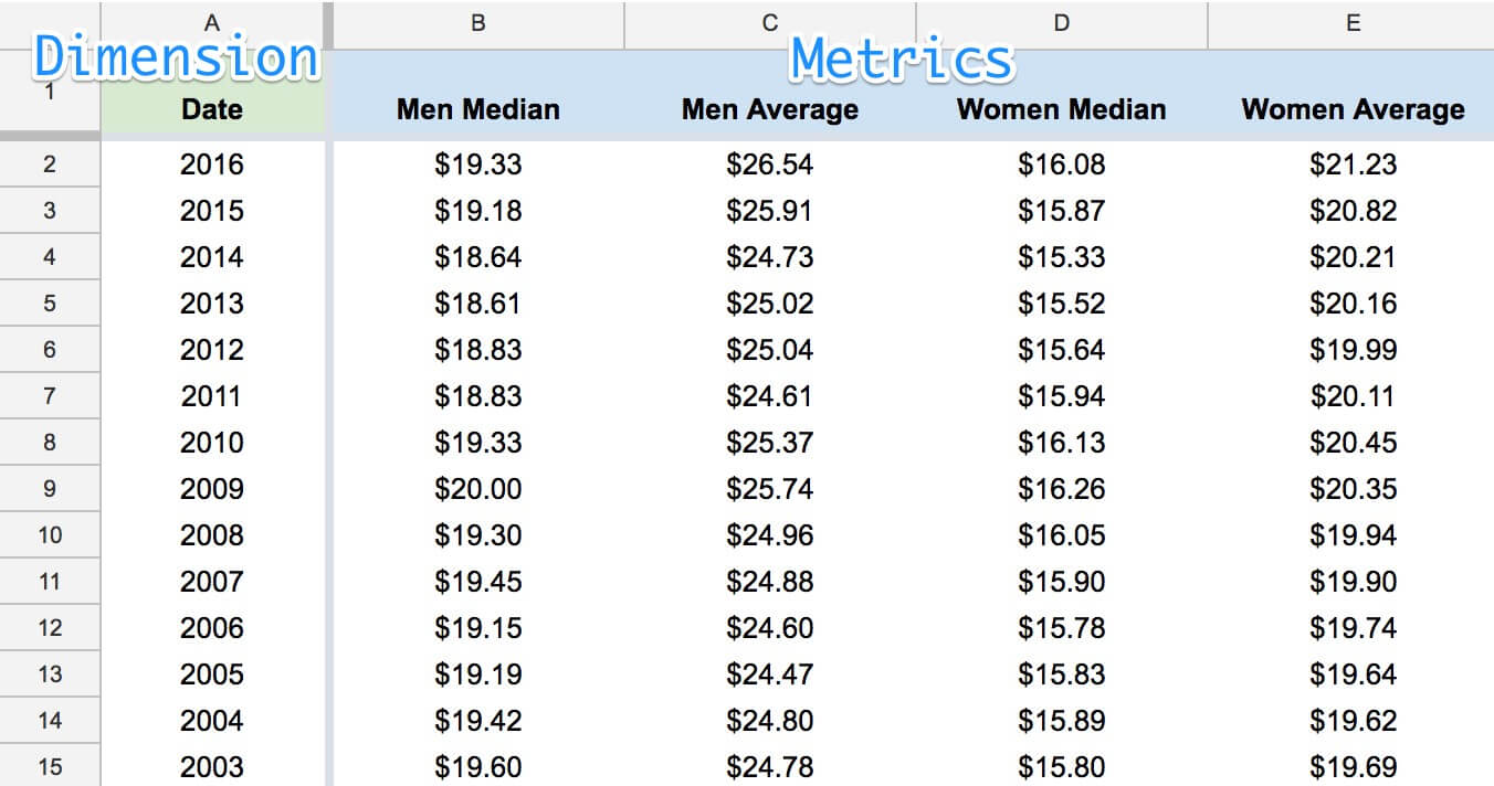
Each dimension and metric in its own column.
Put your data in one table. Bonus points for making sure that table starts in cell A1—right in the upper-left. Each of your examples should be one row. And each dimension (characteristic) and metric (measurement) should have its own column.
In this case, each of our examples is a year. “Date” will be our only dimension. For each year, we’re including many measurements. These are the metrics—“Men Median”, “Men Average”, “Women Median”, “Women Average”. This is a reasonable way to record the data if we want to plot these metrics over time.
These aren’t hard and fast rules. That said, if you treat them as if they are, your life with Data Studio will be easier! Here’s a checklist to consider when you’re recording your data:
-
Each dimension and metric should be in its own column.
-
Each example should be its own row.
-
[Optional] Data should start in cell A1.
-
[Optional] There shouldn’t be extraneous data in the same worksheet. Create new worksheets to store notes, citations, or other tables.
Now you’ve got a well-structured sheet. To follow along with this tutorial, you can create a copy of the Google sheet linked above.
Create a data source
See the documentation for the Google Sheets connector.
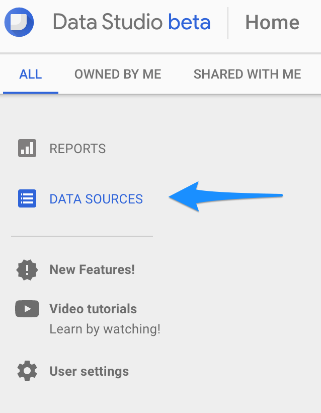
Let’s open up Data Studio. Unlike Sheets, Data Studio has two types of “documents”. It works with reports, and also with data sources. The distinction between the two is important. Data sources connect to your datasets, and they also manage permissions for your data.
To create a data source that connects to Google Sheets, start by navigating to “Data Sources”:
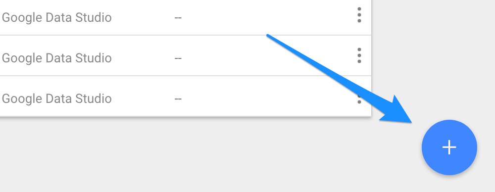
…and click the familiar “make new thing circle button”:
Clicking that button gets you an explorer interface. It lists a bunch of connectors. The connector you want to use is the Google Sheets connector. With that selected, find both your Sheet and the worksheet that holds your data:
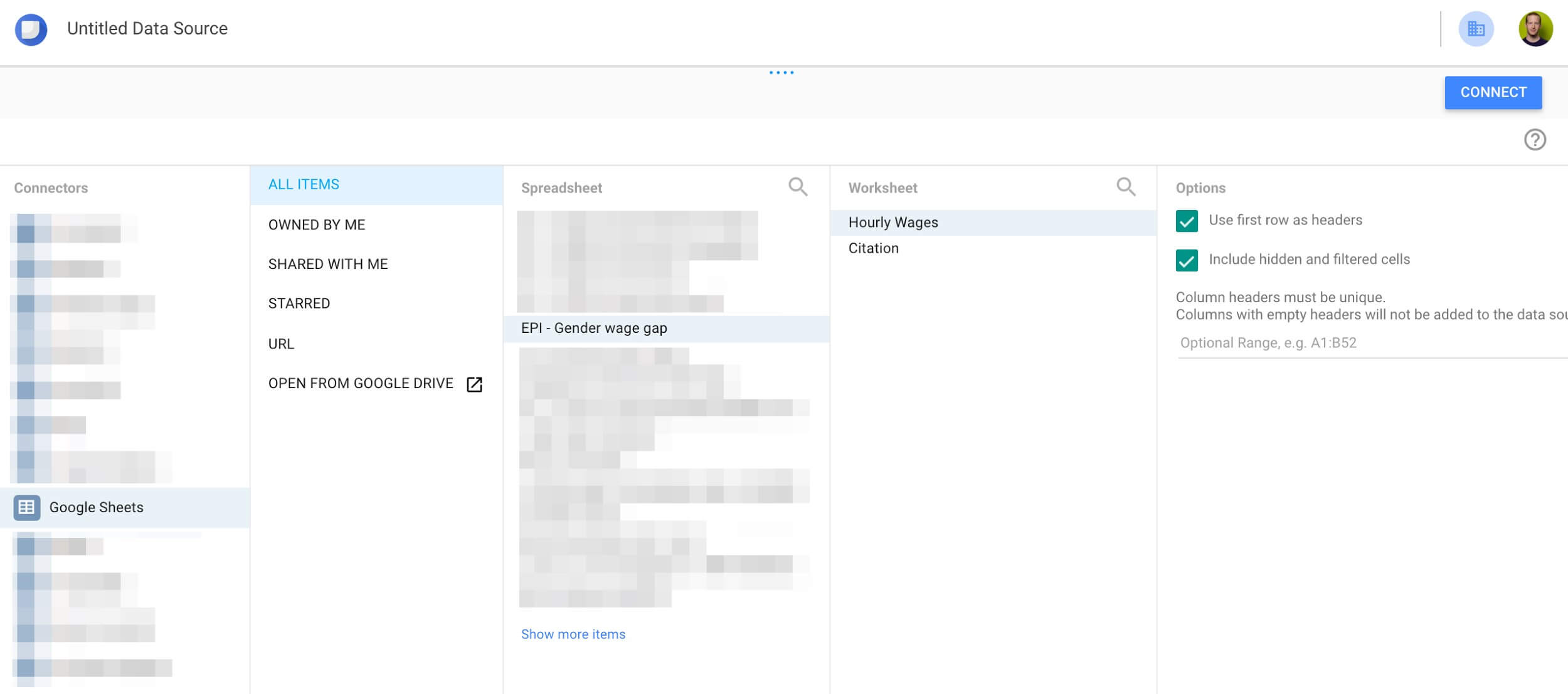
Selecting the “Hourly Wages” worksheet.
Once you’ve selected the worksheet, there are still some decisions to make. You have three options:
-
Use the first row as headers. Selected by default. Does what it says on the tin.
-
Include hidden and filtered cells. Selected by default. If you want to keep data out of Data Studio by hiding its columns in Google Sheets, deselect this.
-
An optional range of cells containing your data. Data Studio looks at the entire worksheet by default. If your table lies in a certain range, specify that here.
Because we’ve organized our spreadsheet well, we can use the defaults. That’s important to note. A well-organized sheet means never having to fuss with these options. You’ll select the worksheet you need without sweating the details.
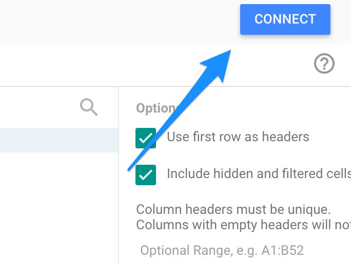
Step 2: Get it together
We can ignore these options since our sheet is well-formatted. Click “Connect” to give Data Studio access to the Sheet:
Now Data Studio can access your Google Sheet. It knows where to look for your data, and whether you’ve labeled it. The next step is to help Data Studio understand what kind of data you’ve given it.
Describe your data
See the documentation for dimensions and metrics.
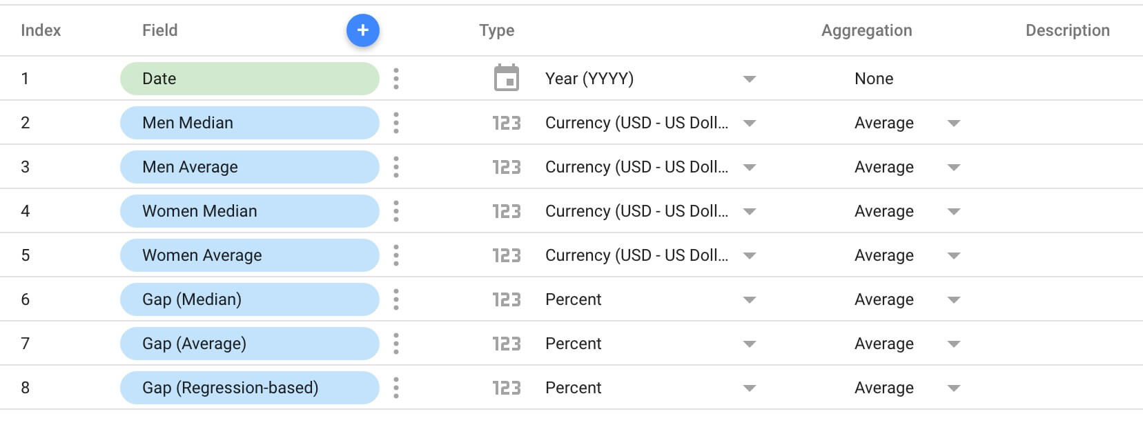
When you connect Data Studio to Google Sheets, it sees a bunch of data. It doesn’t know what that data represents. The most it will do is decide whether a column contains numbers or text. Data Studio is smart about charting data it understands. It uses that understanding to automatically format charts for us. We need to fill Data Studio in on two points:
-
What type of information each field contains.
There are a bunch of different data types. In this case, we have three types: Date, Currency, and Percents. -
How to aggregate each field.
In our sheet, we’ve recorded data by year. We know that in the 2016 row, for instance, the median hourly wage for men is $19.33. To look at the median hourly wage of men across 2015 and 2016? We’d want to average the median salaries for both years, not add them together! (Doing that with this dataset would be invalid because the samples are different. In other datasets, you will want to be able to aggregate.)
Apply these settings to teach Data Studio what it’s working with:
Check out this example data source as you work to get a feel for what it should look like.
Now we have a data source, and Data Studio understands our data. We could jump straight to visualizing our data at this point. That said, Data Studio offers another feature worth exploring: calculated fields. If you want to jump to visualizing, scroll down to “Visualize your data”. Otherwise, read on.
Optional: create calculated fields
See the documentation for calculated fields.
Data Studio allows you to add custom fields to a sheet. Instead of adding all sorts of columns and formulas to your sheet, you can add them to your data source. That’s great because you can add calculated fields on the fly, without modifying your source data. Your new fields will be accessible in any reports that use this data source.
Clicking the blue + next to the “Field” column will open up a space for you to define a new field:
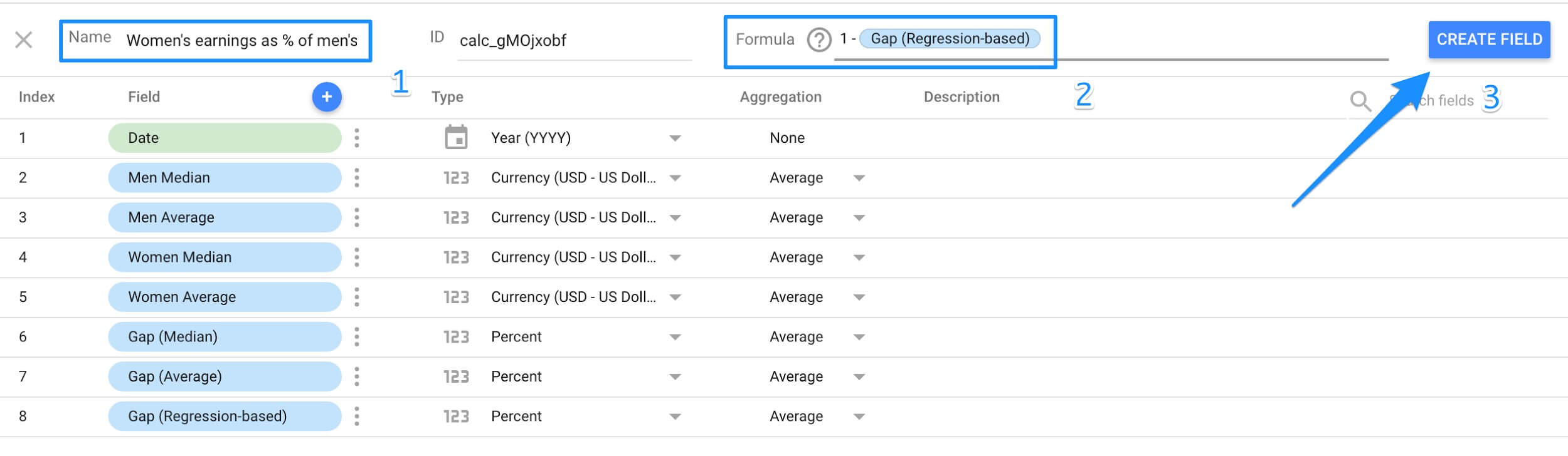
Defining a calculated field takes three steps:
-
Enter a name for the field. This is the name that you’ll select when you include the field in your chart.
-
Enter a formula. This defines the values of the calculated field. Data Studio recognizes the names of existing fields and will auto-complete. The documentation includes a complete list of functions.
-
Click Create Field.
Here’s what we’ll see after adding the calculated field:
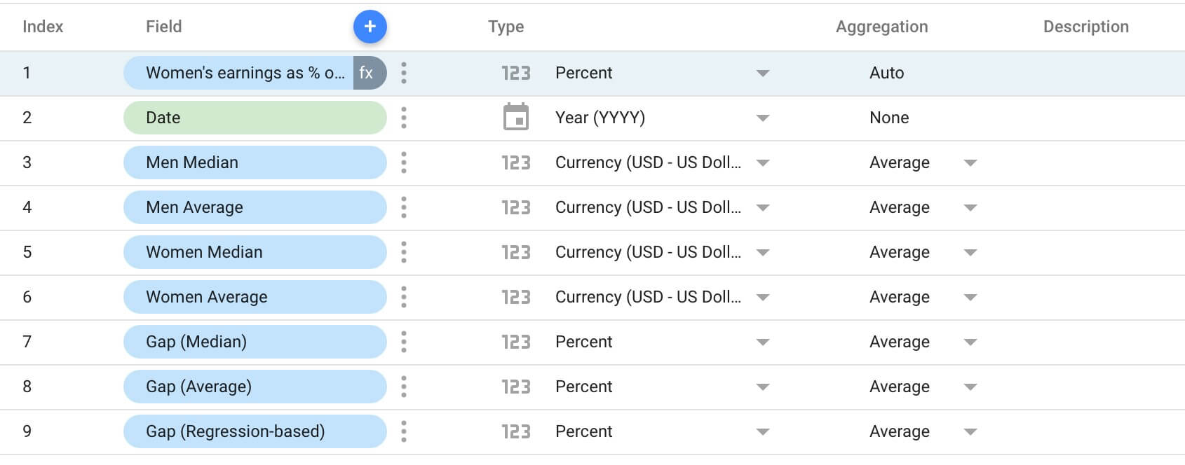
Note that we don’t have the same options we did when we first connected to the Sheet. The aggregation settings are set to “Auto”. Data Studio infers an appropriate aggregation setting based on what it’s calculating.
And—that quickly—we have a new field that we can visualize!
Visualize your data
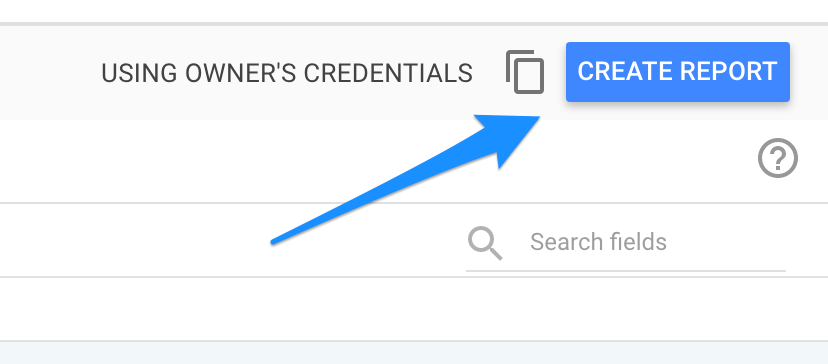
When you’ve created your data source, hit “Create Report”. This creates an empty report with your Google Sheets data source connected to it:
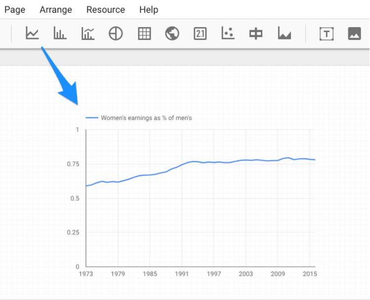
Charts in this report will use your new data source by default. Try adding a time-series chart to the report. You’ll see it instantly populate with relevant data!
That’s all there is to it. You’ve got a data source and report to work with. The rest is up to you!
See the final product
The first chart in the example report uses this data source. You’ll be able to replicate it by adding a time series to your own report. I’ve defined the other charts with their own data sources—with exactly the same process!
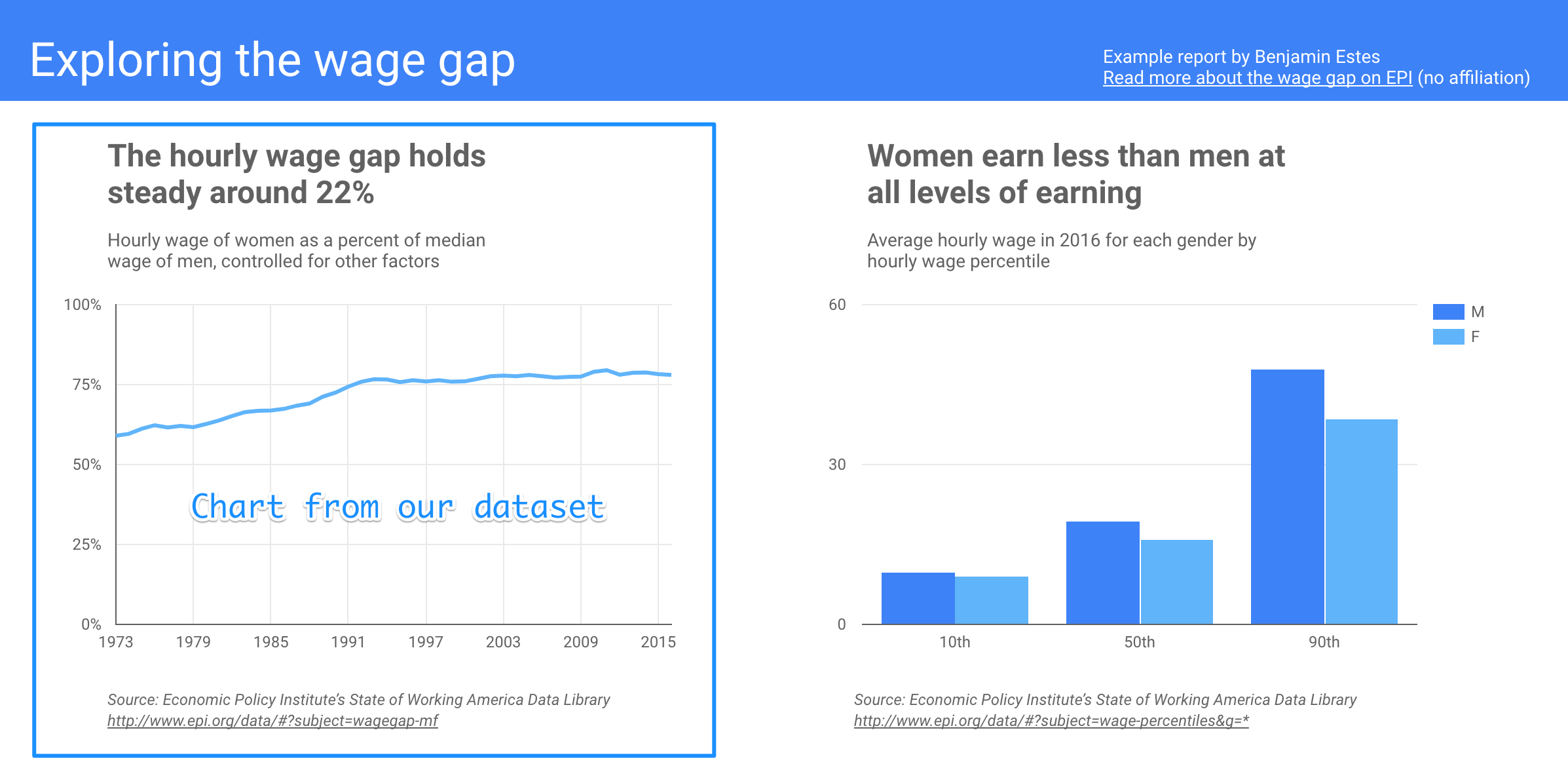
See the Final Report Here, and thanks for reading. If you’d like to learn more about this tool, check out our Data Studio tutorial.